![]() As some of you know Path recently launched Path 2.0 and I heard lots of buzz about it on the Twitters. So I decided to give it a try. I had it for about 3 weeks. My first thoughts were that it was really new and neat but after using it for a while I decided it wasn’t the greatest thing.
As some of you know Path recently launched Path 2.0 and I heard lots of buzz about it on the Twitters. So I decided to give it a try. I had it for about 3 weeks. My first thoughts were that it was really new and neat but after using it for a while I decided it wasn’t the greatest thing.

I liked the user interface. It seemed years ahead of Facebook’s mobile application. I loved pressing the + button for the post menu. I like how it shows you the people who viewed your posts. I also like how it lets you smile, Wink, surprised, sad and heart posts instead of a boring “Like” button. I also liked how you can post the current song you are listening to and then your friends can listen to a sample plus they can also buy it on the iTunes store if they like it. I also like how you could add filters to photos similar to Instagram. Also you can do filters on your video also which is really cool, I haven’t seen that on any other app! I hate how it doesn’t have a landscape view.
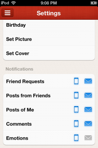
 Since Path is meant for use with close friends it shows you a notification every time someone posts or views your profile. I think sending a notification when someone views you’re profile is a great idea because it lets the person know that you care about them but I also think it can get really annoying. Other people have told me that its annoying when I view their profile and have removed me because of it. I wasn’t meaning any harm by viewing friends profiles and it discourages me from even using Path since annoys them when I view their profile. You also have some notification settings. I think they should add two new settings “Show people when I visit their Path” which turns off telling others you visited your Path. Also have an notification setting for showing you who visited your profile which you can change. So if it’s on and they visit your profile while they have the “Show people when i visit their Path” you will see the notification. I’m not sure if many people turn off notifications or not but I doubt it. Path seems like you’re in a room with a group of people but everyone is being awkwardly silence because it seems like people post less on it than Facebook and Twitter. Only about two of my friends on Path posts daily.
Path is for both iOS and Android. I would call Path the first antisocial social network for this reason. Lets say i have a family member who has a computer but not a smart phone. Well I can’t use Path with them. I think Path at least needs a web version. Path seems very premature still. Also most people I know aren’t on Google Plus, even less on Path.
I put Path in the same group as Google+ because both Google+ and Path brings new exciting features for a social network. I don’t really think both Path and Google Plus will really go anywhere. Facebook copied the circles feature basically from Google+. I think Facebook should copy Path or just buy them then kill them off and merge some of the great features in to Facebook’s mobile applications and website.
I give Path 3 out of 5 stars. They have a great idea but i think they poorly executed on it. I plan to stick with Facebook and Twitter. Online social networking is still a new space and still needs lots of work. Like for example on Circles I could add “Bob” to my tech circle. Bob talks about both his newborn baby and technology startups which are awesome to him. That circle shows posts about both Bobs baby and tech. I only really care about his tech posts. So I’m thinking the future of social networks will have advance artificial intelligence to sort content in to circles automatically. I think some elements of Path do belong in the future ideal social network.
I hope Path will improve the application and has potential. I even gave some ideas in this post and I plan to check in to see how it’s doing every so often. I hope that maybe Path 3.0 will be the prefect app!

