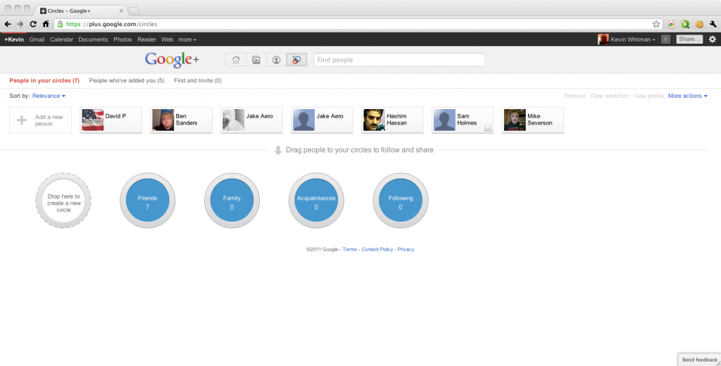
I just got my Google+ invite, after being sent five. One finally worked!
So once an invite works, it will ask for your name, gender and stuff. Then it will bring you to a page to complete your profile, some videos about it.
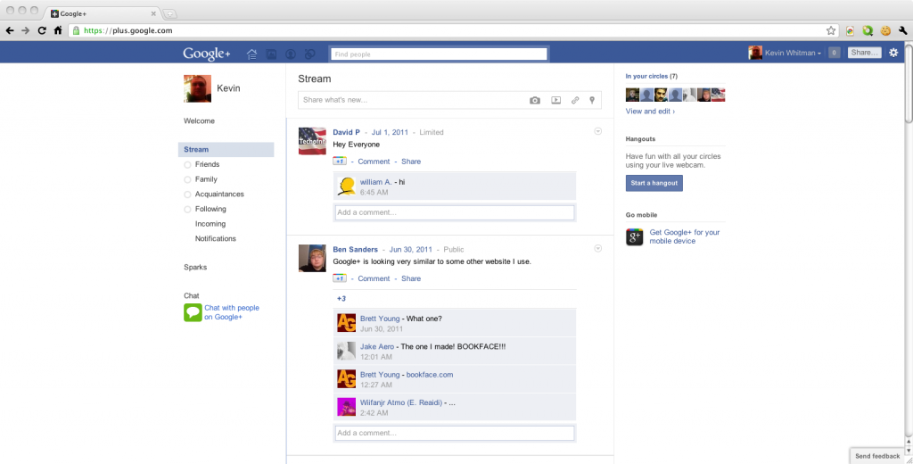 Okay. I’m kidding. It’s not using the same color scheme as Facebook. But you can make Google+ look like Facebook using a User Style at http://userstyles.org/styles/50051/google-facebook
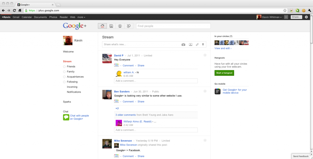 Theres the real home page, for real. I kinda think I liked the Facebook color scheme better, but doesn’t mean I like Facebook social network.
Circles and Stream
I think the coolest part about Google Plus is the circles feature, oh and hangouts. Facebook has a feature similar to this, but not as integrated and is crap compared to circles. On Facebook you can create lists and view them only. But you can share posts to certain people, but it can’t be globally changed across all posts.
On Facebook you can click on the lock when posting something and click Customize.
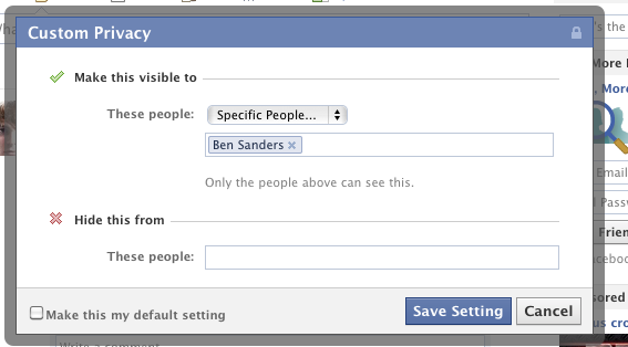 But you have to mark this as default if you want it for each new post, and if you don’t you have to edit it each time for each group of people you want to see it. Facebook makes you be the system integrator. It’s not streamlined like Google+.
 And even if you use Facebook’s custom privacy, if you messed up there is no way to go back and edit it. I was thinking it would let you by clicking the lock, but nope! I think that is a horrible user experience design. Maybe Facebook will get a few lessons from Google+, and I’m pretty sure as how Facebook is fast moving and all they could copy this really easy. They already have parts of it, like custom privacy so maybe they could improve on it…
Google circles are just fun to create!
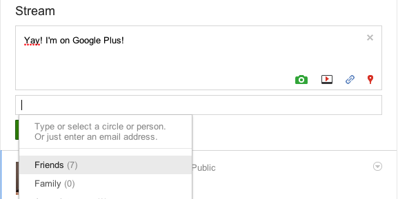 When you post you select from this drop down the circles you want to share with.
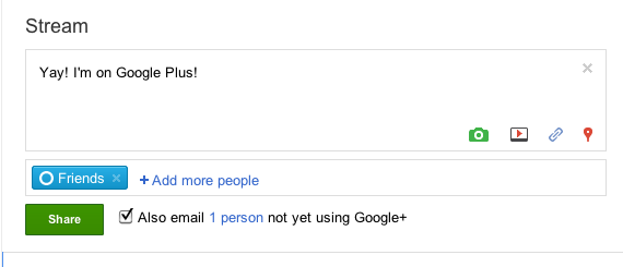 It will show the circles you’re sending it to, under the post. You can click the x by a circle to remove it from being posted it to. You can also have it email people in the circle who’s not on Google+ yet, the post.
 You can +1 post and can comment on it, just like you can do on most other social networks. But it has a drop down on the post, unlike Facebook and other social networks where you can edit the post.
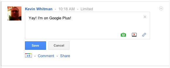 You can edit the post, it does it right inline. No pop up or anything. It doesn’t seem like you can change the circles you shared the post with, but you could edit the circles them self, but would affect all posts.
 It even shows the edit time after you edited it. Nice!
When you delete a post, it asks you to confirm.
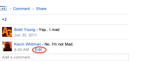
You can even edit your comment!
 You can edit it just like a post. The only issue i have with comments is when you hit delete, it doesn’t ask you if you are sure you want to delete it. 🙁
![]() It shows the edit time on comments also!
It shows the edit time on comments also!
Photos
When i first heard Google+ was going to have Photos, I was like what about Picasa? Google can’t have 2 different photo apps, can they? Well the thing is, I never used Picasa so I just checked it out today. My profile picture i uploaded to Google+ was in Picasa, and I commented on my photo in Picasa. Switched back to the Google+ tab and the comment was there, no refreshing or anything. It showed up in the stream. Awesome! And according the Android Police photos you upload via Google+ don’t count towards your Picasa storage limit! The photo app seems like it works just like any other Photo App on other social networks, but the Picasa integration is nice!
Sparks
I’m not sure if Sparks will be useful. I can add my interests, but I don’t see them on my profile. When I click on a spark, it just shows results for that out on the web…. Not sure how its different from search. When I find something interesting, i share it with people on Twitter or Facebook anyways, don’t need a new product for that. Share buttons on websites are nice to share with others. But i don’t think i need anything else to find interesting stuff, Twitter, The Stream on Google+ or Facebook’s Wall, Stumbleupon, Digg and more helps me find interesting things. So I’m really lost on what Sparks is for… How does it help me?
Hangouts
This Mac I’m on, doesn’t have a web cam. So to test hangouts, lets switch to my laptop.
 Well my hair looks okay. Lets Hangout!
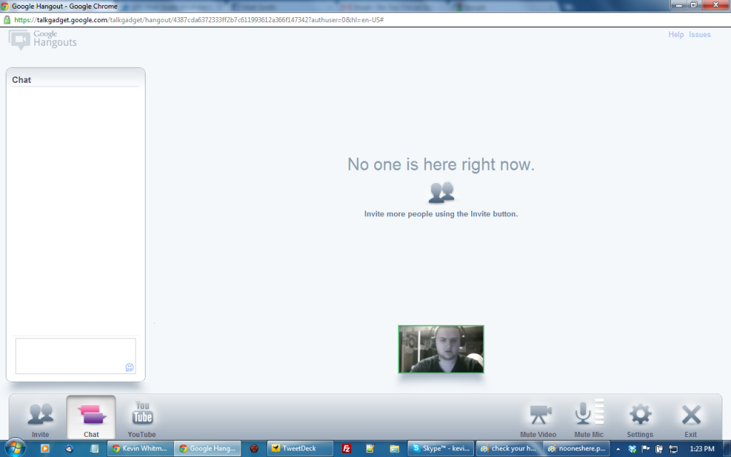 You can chat on the side if you open chat. I think mostly i would be using video/voice chat, but this is great when i need to share a URL, a spelling of someones name. I kinda wish it had a feature to show my desktop to other people, like if i wanted to teach them how to do something, get feed back on a web design, etc.
 Someone joined! You can click on their picture to view them in the bigger window, it didn’t seem to switch to the bigger screen when they talked, which would be a nice option.
 It posts on your stream the chat, plus shows who’s in it. Really nice integration!
 You can click on the YouTube button and search for a video to play. It will give you a switch to YouTube button!
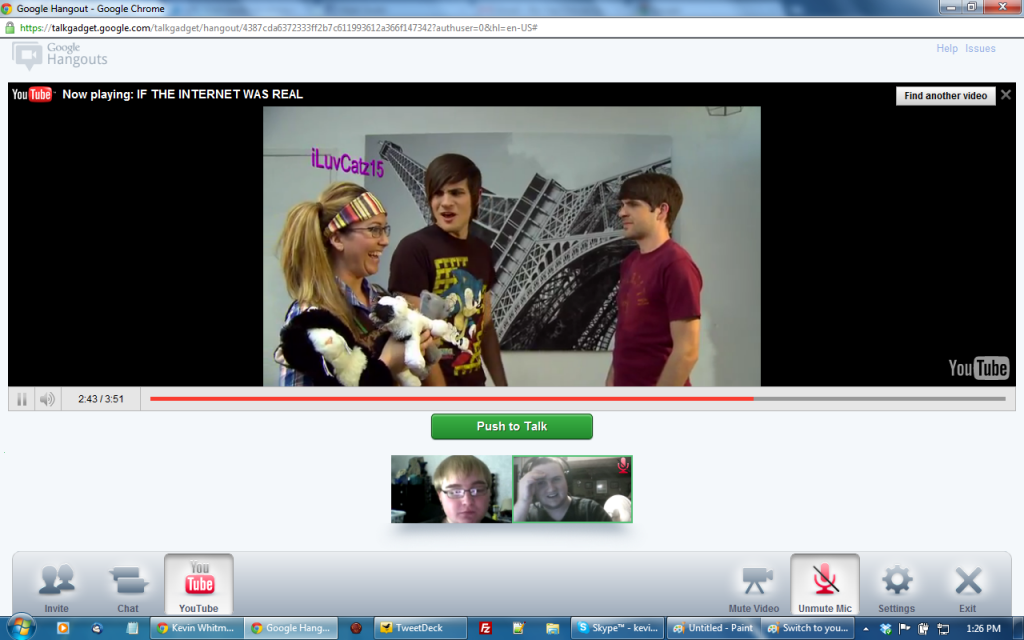
It shows the video, it mutes your mic where you have to push to talk. I really like how we can watch the video at the same and see each other facial expressions! Really nice feature. I think its even better than watching TV with people in real life AKA in person. We we’re watching a wonderful YouTube video by Smosh, called “IF THE INTERNET WAS REAL“.
 When everyone leaves the chat, it shows that you hung. It’s the same post as earlier.
Google menu bar
Another benefit Google has is that when i want to do lots of stuff like search for stuff, plan a trip with maps, read the news and more, i use Google. So even when I’m doing unsocial stuff, i get the Google Bar at the top. Also the first thing in this bar is now +Yourname.
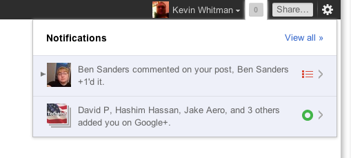 It shows you notifications on Google Plus in this bar, which is nice.
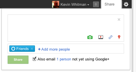 You can also share to you stream right from that bar, which is also nice! I think this bar across lots of products is a really good benefit Google has over Facebook.

